Pro Tips
The knowledge of color theory is paramount for any make-up artist and enthusiast. Color theory goes in so many directions and can become incredibly complicated. In this blog we want to break it all down and bring you the important parts you need to know. Color Theory - Advanced
Color Systems
First of all, it’s important to mention there are various color systems depending on the type of medium color is used in. In this case, we’re talking about the RYB system of Red, Yellow and Blue, typically used by artists working with color cosmetics or paints. You may also have heard of CMY - Cyan, Magenta and Yellow, or CMYK, with the addition of key (Black) this is used in graphics and printing, or RGB which is the system used in electronics such as television, photography and computers. The main difference between them is, when considering RYB we are looking at the physical presence of a color either in an object or living thing, something you can touch like the face or an apple for example. This is known as subtractive. The others are colors that are created by something you cannot touch i.e. light, rainbows, reflections and digital color imagery on screens. These are known as additive. This is why we have a different impression of colors created by light and physical colors, and of course why make-up and other physical colors can look different on camera or screens to how you perceive it with your eyes.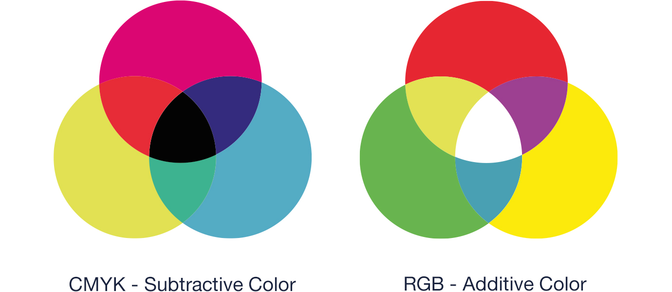
The Color Wheel
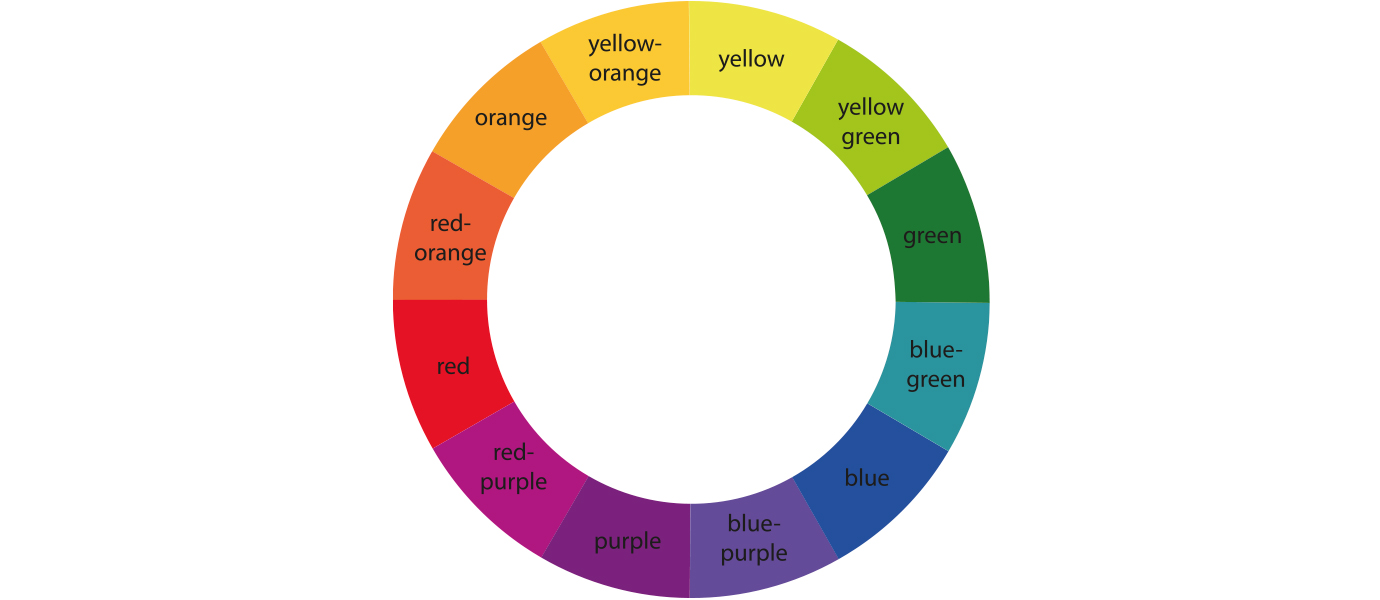
So, let’s start with the fundamental model subtractive color mixing is based upon. The Color Wheel developed to this stage by Isaac Newton in 1666.
The color wheel displays a logical sequence of 12 colors or hues in relation to each other which helps to illustrate color theory in the simplest way. The wheel is a tool that helps us to understand how colors relate to each other and how the human eye perceives them, which is fundamental when approaching make-up. The color wheel is laid out to initially showcase the relationships between the primary colors, plus the colors and hues that bridge the gaps between them.
Color Terminology
First let’s break that information down.COLOR is categorized by three characteristics HUE, VALUE & INTENSITY.
HUE is the pure color that is found in the color wheel including the primary, secondary and tertiary colors.
VALUE is the relative darkness or lightness of a color. (Otherwise known as the Grey scale, but we’ll get to that in a moment)
INTENSITY is the purity of a color with regards to how bright or dull it appears.
So, with that in mind, let’s go a bit more in depth with how colors and hues are classified.
Color Combinations

1. PRIMARY colors are those that cannot be made by mixing other colors together and in this instance, they are Red, Yellow and Blue.
2. SECONDARY colors are hues created by mixing full saturations of each primary color together. They are Orange (mixing Red and Yellow), Violet (Mixing Blue and Red) and Green (Mixing Yellow and Blue).
3. TERTIARY colors are hues created when mixing a primary and secondary color. They are Red-Orange, Yellow-Orange, Yellow-Green, Blue-Green, Blue-Violet and Red-Violet.
Primary, secondary and tertiary make up the 12 colors of the color wheel.
4. COMPLEMENTARY colors are those that when mixed together cancel each other out, forming a tone on the grey scale. They’re also sometimes referred to as ‘opposite colors’ or ‘correcting colors’ and are always found directly opposite each other in the wheel.
5. ANALOGOUS colors are a group of three colors that are next to each other on the color wheel, made up of a primary, secondary and tertiary color or hue.
The Munsell System
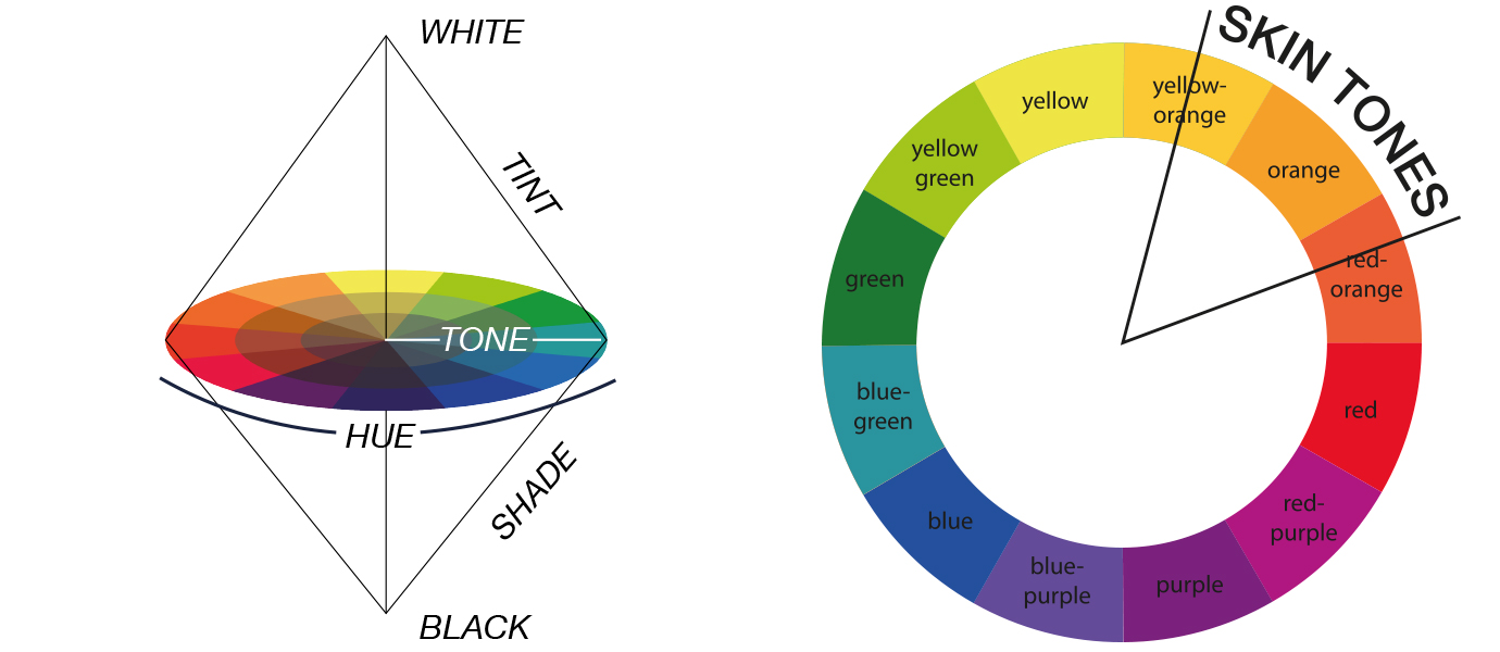
Here’s where it gets a bit more interesting, all artists know the importance of black and white, but right now it isn’t present in this example. Let’s hypothetically turn the color wheel horizontally and explore the next level.Imagine the color wheel as a globe spinning on an axis.
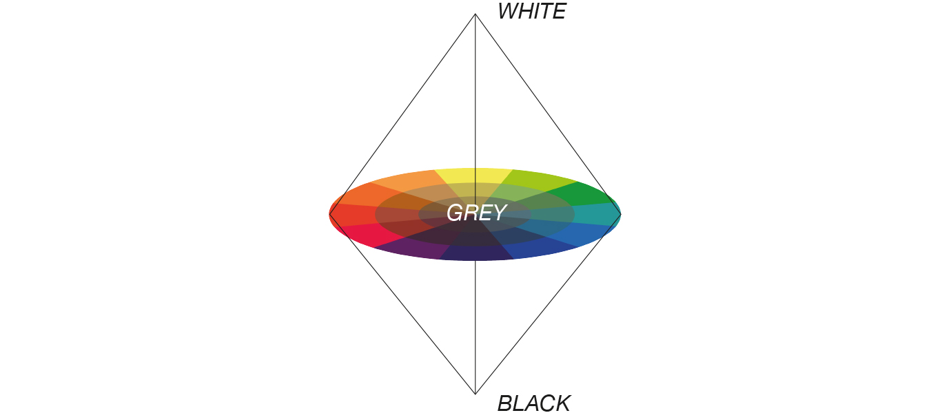
White is at the top of the globe and black at the bottom. Mixing black and white together makes grey, therefore grey is situated in the center of the circle. This is what allows us to create a tint, tone or shade or a color.
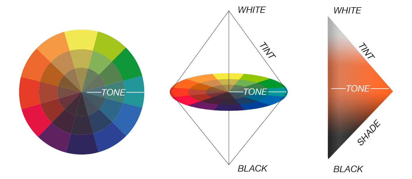
TINT – adding various degrees of white to a color or hue effectively making it lighter.

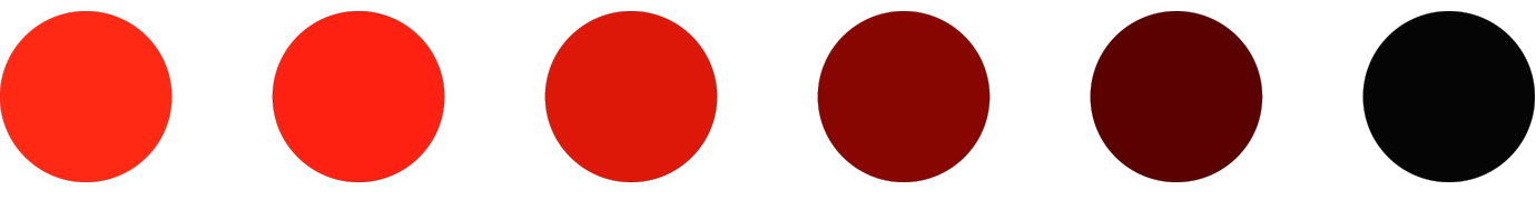
Shade - adding various degrees of black to a color or hue effectively making it darker.
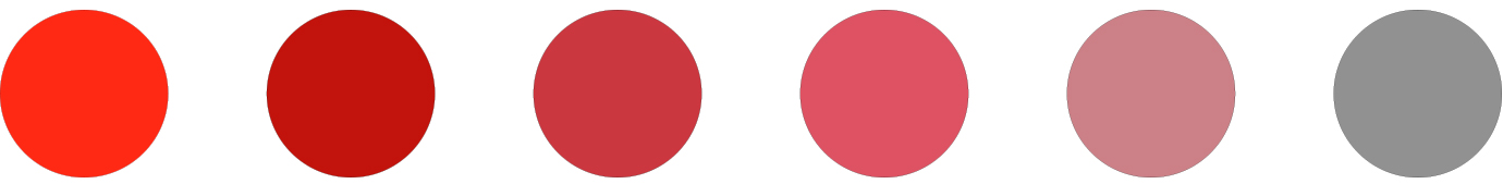
Tone – adding various degrees of grey to a color or hue effectively making it duller or less vibrant.
Skin Tone, Undertone & Complexion
Now we have that information, let’s go a bit further into color classifications before we bring this theory into relation with make-up specifically.
Colors themselves can be classified as warm or cold. This is due to our perceptions of them. Cold colors and hues have shorter light frequencies and we usually perceive them to be calmer and softer. Warm colors and hues have longer light frequencies which can advance in space and for that reason we perceive them to be more impactful with higher energy.
Now, how do we relate all this to make-up?
Let’s start by looking at how color works in skin.
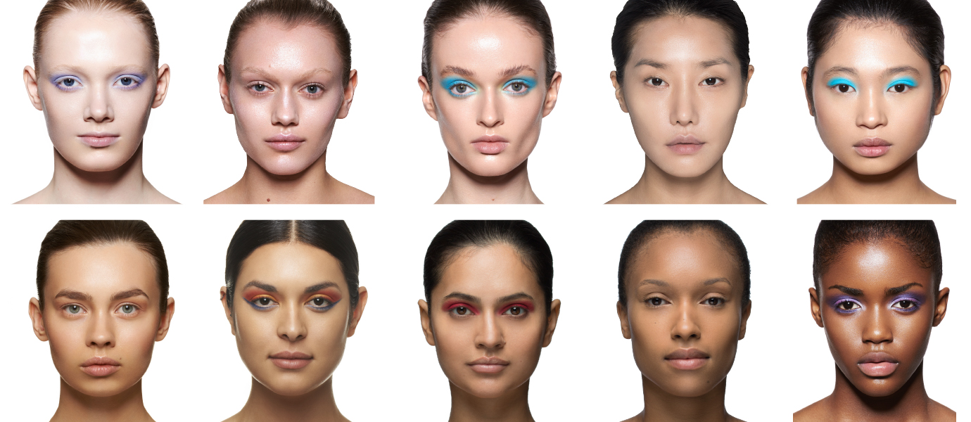
The SKIN TONE sometimes referred to as the COMPLEXION is the surface color we see when looking at a glance to the skin, it’s the most predominant coloring we see. This is mainly affected by the amount of melanin in the skin. Melanin is dark pigments within our bodies that determine how light or dark our hair, eyes and skin tone are.
Then of course there is UNDERTONE. This is when a lot of people get confused, when it comes to skin and color matching specifically. Undertones are the subtle more muted colors beneath the surface of the skin. They do not change with the effect of lighting, tanning or any other external factors.
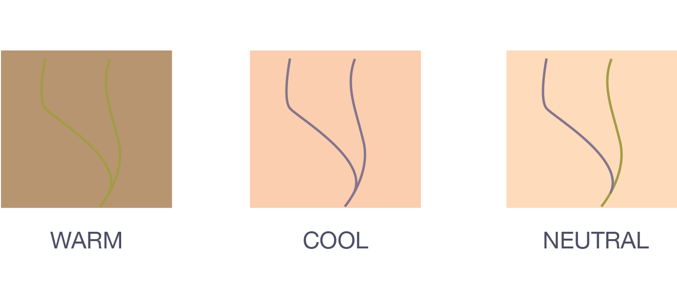
One of the easiest ways to determine this is by looking at the veins on your wrist. The color the veins appear determine the undertone of the skin.
Blue or purple – COOL UNDERTONE
Blue – Green NEUTRAL UNDERTONE
Green or Olive – WARM UNDERTONE
Color Correction
There is a common misconception that those with fair skin are cool undertones and dark skin warm, this isn’t true. You can find people that have dark skin with cool undertones and vice versa. This is one of the reasons why sometimes a foundation appears to match the skin tone, but once applied looks too grey/ash, yellow or warm. The undertone has been misjudged. So, always ensure you know for sure what the undertone is.In relation to the color wheel, skin tones are all found within yellow-orange to red. Skin tones with a cool undertone tend to have a hue towards red-purple. Skin tones with a warm undertone have a hue towards yellow. Dark skin tones and shadows (contours) will be found in the ‘shades section’ while light skin tones and highlights are in the ‘tint section’. Skin tones also vary in saturation and therefor can be found anywhere around the hue sections and in through the tone sections but always between yellow –orange to red.
It’s common practice in make-up artistry to use color correctors to achieve a balanced skin tone across the face and/or body. This could be covering dark circles under the eye, bruising, hyper pigmentation, vitiligo, rosacea, basically anything that is a contrast to the skin tone. This is when it’s important to have a good understanding of color theory, particularly complementary colors. We discussed earlier how complementary colors cancel each other out, so with this exact theory in mind color correcting can be achieved.
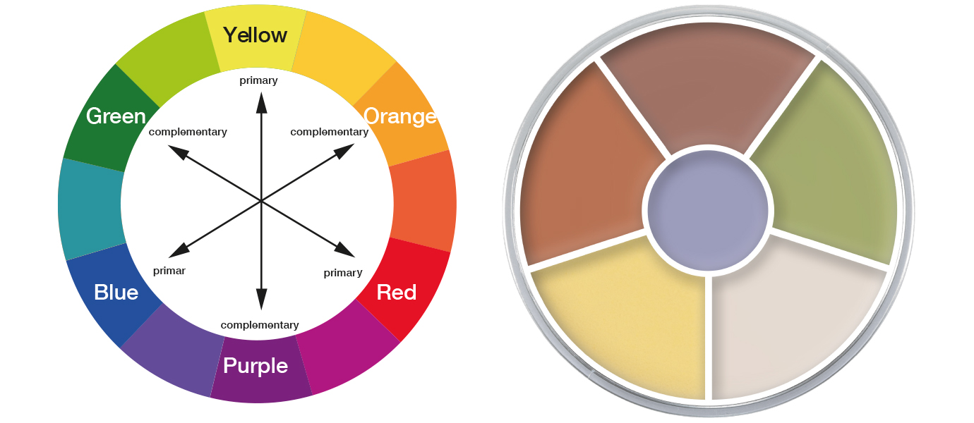
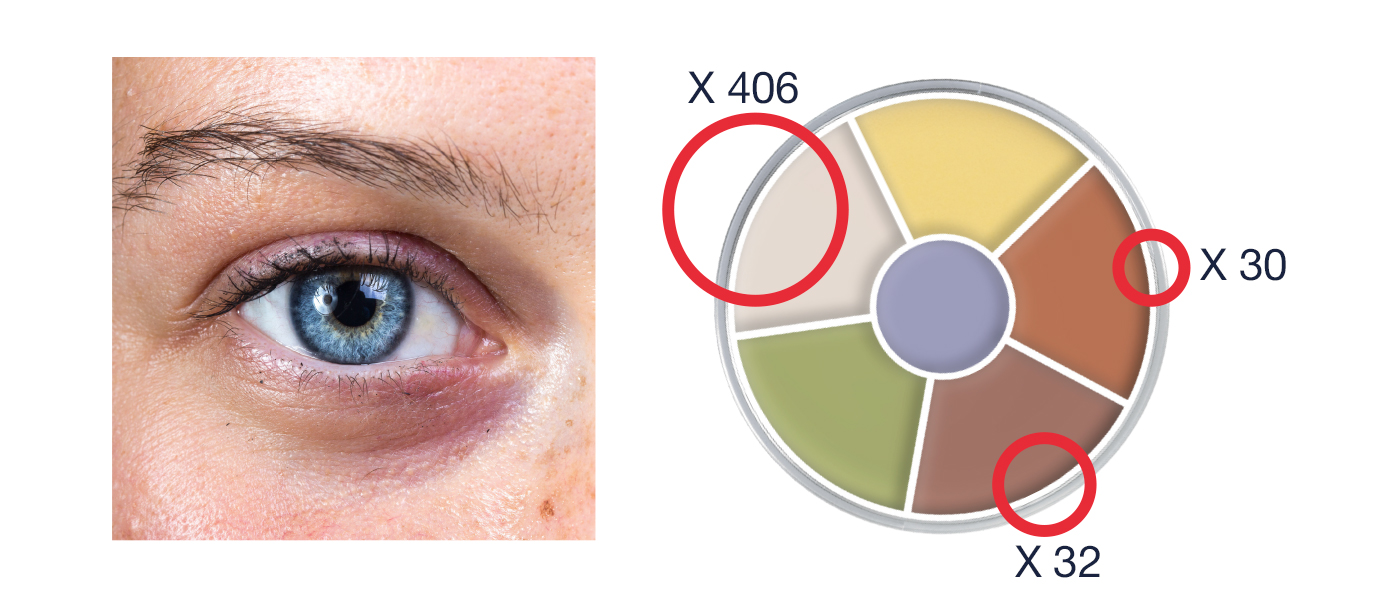
Pictured here is the color wheel and CONCEALER CIRCLE ‘Neutralizer’. You will see that each color needed to correct discoloration of the skin tone is present in the circle, plus a neutralizer to adjust the intensity of the color depending how strong the complementary color needs to be in order to correct effectively. This can only be judged in each individual case, once skin tone and undertone have been identified.
The effect of Light
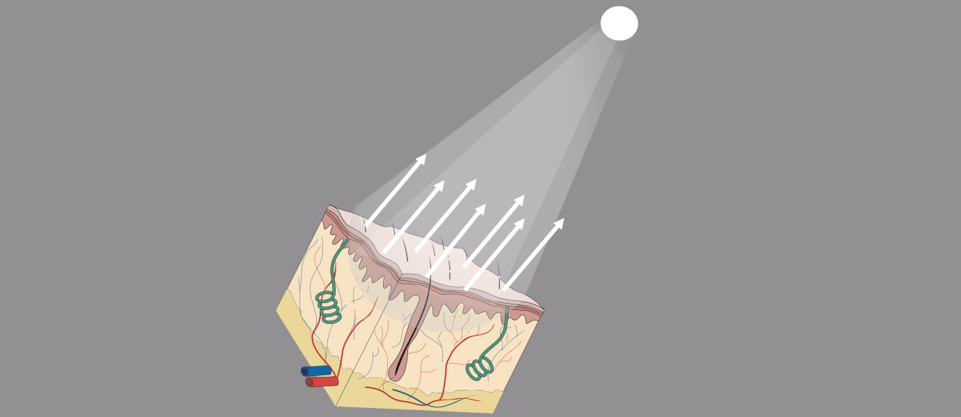
An important element in color theory when it comes to make-up is how skin is affected by light, both with and without make-up on. Light is a crucial element to consider when applying any color to the skin. It has a dramatic effect on how we perceive it.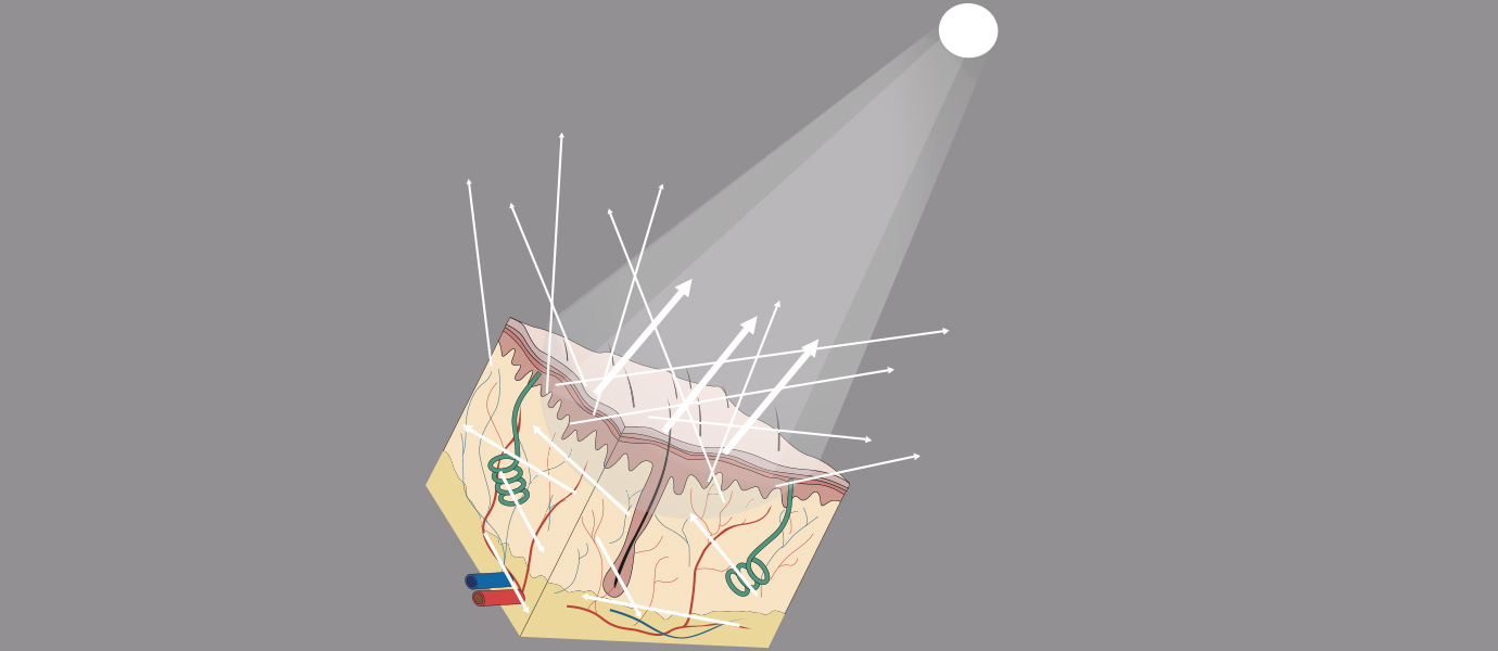
Irrelevant of the light source or skin tone only 4% to 7% of visible light is completely reflected from the surface of the skin. The rest of the light penetrates the surface to the underlying dermis where it is reflected from within and leaves the skin in a diffused way. This part absorption of light and reflection in different directions is what gives our skin its natural shine and appearance of semi transparency.
When attempting camouflage, we tend to use concealers which contain high pigment content. This makes the foundation more opaque than the natural skin, and once powdered can result in total reflection of light, this results in the make-up looking artificial and the illusion of camouflage or natural correction is lost.
Question. So, what do we do to avoid this?
Answer. By utilizing our color theory!
Mastering Camouflage Correction
Sometimes when correcting pigmentation, it’s advisable to start with the complementary color, set with powder and then add the skin tone. However, it’s important to understand that you will not always need a complementary color in its purest concentration to achieve a camouflage. Especially when considering where you’re applying the make-up. Thick applications of make-up on areas of thinner skin will not achieve the best results, it usually results in the make-up looking cakey, creates lines and looks obviously artificial, the illusion of camouflage is lost. Therefore, the layers applied to the skin should be as fine as possible, if the intention is to keep the surface looking like natural skin. This is when your knowledge and understanding of color theory comes into play. Mixing complementary colors with neutralizers and similar undertones to the skin can help achieve effective corrections in fewer layers.Let’s take a look at some examples of dark circles under the eye. You’ll notice in each image the coloring under the eye is always darker than the skin tone but in varying degrees, therefore different concentrations of complementary color would be needed for each.
Color Theory Correction Exercise – Time to test your skills!
It is never a perfect science when trying to determine color on a digital screen, however, take a moment to analysis each of these images and when considering the Concealer Circle ‘Neutralizer’ which colors would you mix together and in what concentration to correct the pigmentation in these cases and move as close to the natural skin tone as possible.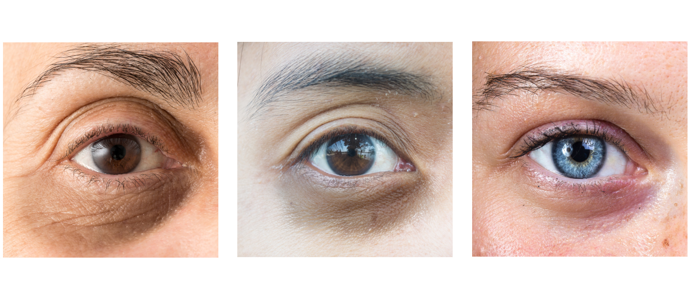
Analysis results
Here’s what we concluded: In the first image we can identify that the skin tone is pretty neutral with a cool undertone. The dark circles have a mainly blue undertone with hints of green.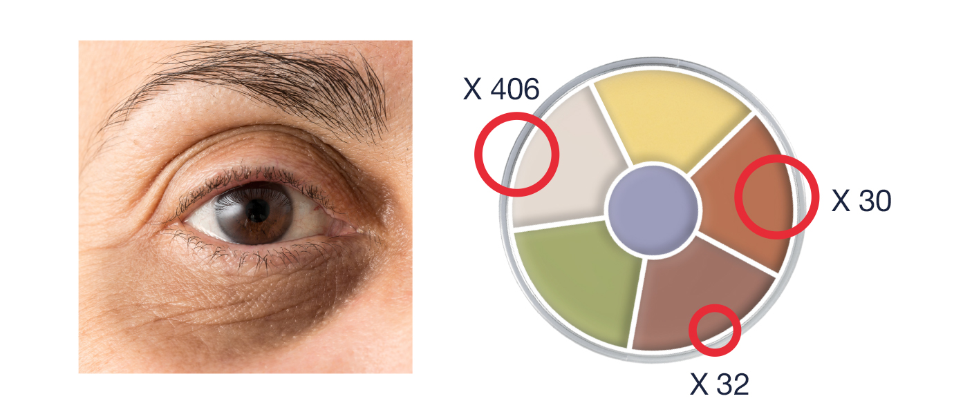
So, when selecting complementary colors, we chose the bright orange (X30), in the highest concentration, to help correct the blue and mixed it with almost equal quantity of the highlighter (X406) to bring it close to the natural skin tone. Then a touch of the red (X32) to help neutralize the green undertones. This mixture together would effectively conceal the dark circles and appear more natural to the surrounded skin.
In the second image we can identify that the skin tone is yellow with a warm undertone. The dark circles have a mainly blue-green undertone.
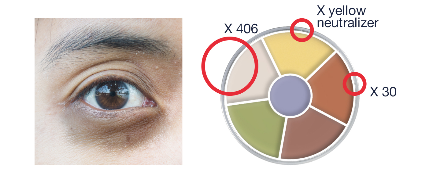
So, when selecting complementary colors, we chose the highlighter (X406) in the highest concentration, we don’t want the fairness of the skin to be warmed too much by the corrector tones. Then equal parts of the X yellow neutralizer and the bright orange (X30) to bring it close to the natural skin tone and the X30 to correct the dark pigmentation. This mixture together would effectively conceal the dark circles and appear more natural to the surrounding skin.
In the third image we can identify that the skin tone contains more pinks with a cool undertone. The dark circles have a mainly blue-purple undertone.
So, when selecting complementary colors, we chose the highlighter (X406) in the highest concentration, we don’t want the fairness of the skin to be warmed too much by the corrector tones. Then the red (X32), in less concentration and an even smaller touch of the bright orange (X30) to bring it close to the natural skin tone. This mixture together would effectively conceal the dark circles and appear more natural to the surrounded skin.
With this theory understood it will be possible to adapt the knowledge to cover any shade of pigmentation in the skin. Just refer to your complementary colors in the wheel and analysis the skin to determine the correct skin tone and undertone.
There are other factors to consider when approaching color theory. One important one for make-up is considering light temperature.
Color Temperature
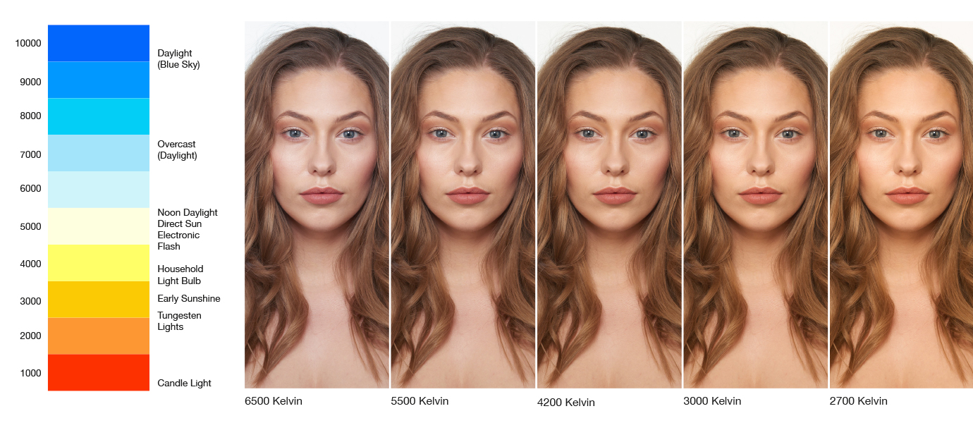
This example shows the difference cooler, natural light, can have compared to warmer, artificial light. The original image was taken with an electronic flash of around 4200 Kelvin. As the light is adjusted to a cooler, more blue light, it actively neutralizes the warmer tones in the skin and make-up, through our understanding of color theory we know that blues are the complementary colors of yellow-orange and therefore it cancels them out. This tends to make everything look a little more stark and sharp, without the balance of warmth and can be more unflattering in comparison. That’s why when we consider candle light, everything looks more appealing, the warmth and contrast within the face is more flattering.
The best advice for make-up is always, where possible, to apply in natural daylight. Daylight provides us with the full spectrum of color, is evenly diffused and clear, so it shows the make-up in its most true state. It will be more apparent in natural daylight if a color match isn’t correct or if something isn’t evenly blended. That way you can build the shadows and depth of color to be the true representation of how you want the make-up to look, and then in any other light will still look flawless. There is a lot to take in when approaching color theory, but to have an understanding of it is vital to mastering make-up. Practice makes Perfect.